

the tool library
location:
new york, new york
tools:
figma, gemini, google slides
project duration
february 2025 - may 2025
my role:
ux research
ux design
ui/visual design
information architecture
project stages
case study overview
the process
the problem
the service
the goal
the problem
Purchasing tools can be expensive and hard to acquire by many. Many of us also have limited space, especially those living in urban settings. This makes it hard to justify buying tools for a once time need if you can't store them. Knowing how to use tools properly can also be frightening for users and can deter them from trying it themselves.

the service
The Tool Library aims to be a community hub center that inspires creativity, confidence and connections. Our program is great for local homeowners or renters, college students or anyone who’s got a DIY project they’re dying to work on! Along with borrowing tools, members can sign up for local workshops, and find online tips and tutorials for a wide range of projects!

the goal
With this sharing program, we hope to encourage and empower all to pursue their projects regardless of the size and difficulty, and without the burden of purchasing their own tools and having to store them. The in-person workshops aim to encourage helpful discussions, community friendships, and build upon tool skills knowledge, and safety.

understanding the user
the process
user research overview
user pain points
user personas
user journey maps
problem statements
user research: overview
The Tool Library can be a tricky concept to understand but we want to ensure our users it’s more simple to navigate than they think. I conducted user interviews to better understand the target user, their needs and pain points. Using the information we gathered, we created personas like Frankie and Olivia whose storylines provide insight to continue iterating and working towards a better user experience.
Many want an easy, clear, and engaging design that allows them to discover the perks of our membership. We want to make it easy for users to get the tools they need for all their projects, hassle-free!
user pain points
1
Financial Burden
Tools, small or large can be expensive to purchase. Finding a place to to work on projects can be an additional cost.
2
Tool Avalibility
Making it clear what tools are available and noting how long you will need to borrow them for projects. Creating a waitlist for popular items.
3
Lack of tool knowledge
Provide a section with tips for which proper tools to use for specific projects and how to use them safely.
user personas: frankie

Age
21
Occupation
full-time architecture college student
Location
morningside, manhattan
Behaviors
-
Lives with 3 college roommates
-
Mostly day classes for school and long hours for coursework in the evenings
-
Works part-time 12-18 hours/week
-
Enjoys exploring the city and hanging out with friends
"I need an alternative solution when our schools shop is full or not available, and I need to work on my studio projects."
Needs & Goals
-
Needs a budget-friendly option with perks - is a college student discount available?
-
Option to reserve a workspace since his apartment is small and shared with others.
-
Always out and on the move so mobile app preferred for easy booking
-
Notification reminders for bookings and workshops since he has a busy student schedule
user journey map
Goal: Browse through the tool library to find a specific tool needed for project and checkout.
Action
1
Browse
'The Tool Library' app
Task List
-
Open the app on mobile device
-
Browse through homepage menu
-
Select tool library menu button
Feeling Adjective
Excited to explore the app and learn about the program
2
Explore the Tools
-
Browse tool library section menu
-
Search section for tool in need of
-
Keep in mind when tool is available
Feeling optimistic about their project with the easy navigation so far
3
Select Tool
-
Select tool option to learn more
-
At the bottom- similar tools shown
-
Add to cart or keep shopping
A bit overwhelmed with the various types of tools and how to use them
4
Shopping Bag
-
Go to shopping bag
-
Review items
-
Move to checkout or edit
Feeling a bit discouraged when locating the shopping bag button
5
Checkout
-
Review/edit member details
-
Select borrowing dates & pick up time
-
Confirm request
-
Confirmation email with details pending
Happy to find what they needed and get working on their project
user personas: olivia
Age
32
Occupation
artist & plant enthusiast
Location
bushwick, brooklyn
Behaviors
-
Lives with fiancée and pet cat
-
Has a flexible schedule but tries to dedicate at least 6 hours towards her art daily
-
Her fiancée works full-time at his office, giving her space and privacy at home
-
They like spending time together on the weekends and going on bike rides
"I would love to connect with other local artists and designers to share our mutual love for creativity and building."
Needs & Goals
-
Tool lending program allows her to save space at home and keep tools away from her cats
-
Wide range in tool options to choose from for the various types of projects she works on
-
She is typically working on designs and emails at home so web access preferred
-
Interest in workshops and events to connect with other members in-person
user journey map
Goal: Sign up for workshops to build on tool knowledge and confidence, while meeting new people who share similar interests
Action
1
Browse
'The Tool Library' app
Task List
-
Open the app on mobile device
-
Browse through homepage menu
-
Select workshop menu button
Feeling Adjective
Excited about the in-person workshops and meeting new people
2
Explore the
Workshops
-
Scroll through available options
-
Keep note of difficulty level
Sparks of creativity as the workshops include a wide range of projects
3
Select Desired
Workshop
-
Make a selection
-
Review event information
-
Share event with a friend
Feeling comfortable learning how to use new tools with the help of experts
4
Sign Up
-
Provide contact information
-
Confirm membership
-
Confirm request
The tool knowledge confidence is building up.
5
Confirmed
-
Confirmation pop up
-
Confirmation email with details pending
Can't wait for the event and shares it with her bestfriend to attend too
defining the problem
problem statement
Frankie is an out of the box thinker and dedicated college student who needs an intuitive on the go app because they need alternative resources and accommodations for completing their studio projects.
problem statement
Olivia is a local creative artist
who needs an website that is accessible to navigate and browse because they want to be able find workshops that will enhance her tool skills and make friends at the same time.
developing the design
the process
how might we
solution concept
site map
paper wireframes
digital wireframes
lo-fi prototypes
usability study
'how might we...'
solve our problem?
Transforming our problem statements into 'how might we' questions helps us designers brainstorm ways to solve the problems. I asked myself:
-
How might we help users to understand our policy and benefits so they can maximize their membership?
-
How might we create an approachable design with clear information so that users may navigate comfortably?
-
How might we help users feel confident so they can achieve their needs?
what is our
solution concept?
After researching and gathering insight from our users, we aim to create an app and website that targets addressing the users pain points and needs.
-
Provide different tiers of membership to fit all kinds of users needs and budgets.
-
Concise menus that list all options with clear language on all pages for easy nagivation.
-
Providing all the needed information for signing up to workshops as well as on for the online tutorials/tips page.
site map
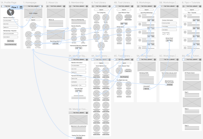
In order to avoid user frustration or confusion while browsing through the app, I created a sitemap. I used insights from the user persona journey maps to develop the main categories and subcategories. This defines the overall structure for the app and site that enables users to move through the app via certain order/steps.

paper wireframes
For quick and rapid iterations, I used pen and paper to create my wireframes. This allowed me to maximize my ideas without getting caught up with the little details. I marked stars on components that I thought worked best and wanted to incorporate in a refined iteration.


digital wireframes
I moved onto creating digital wireframes using Figma, which helped bring more clarity to the overall structure and design concept. This design prototype was then tested with users during the performed usability study.

lo-fi prototype:
overview
lo-fi prototype:
check it out yourself
There are a couple different user journeys one can take when using the app such as:
-
Exploring the homepage
-
Learning about the program and signing up for a membership
-
Browsing through the tool library for tools to borrow
-
Browsing for workshops to attend or online tool tutorials/tips

user research:
parameters
Study Type
Usability Study
Unmoderated
Location & Time
About 15-25 minutes
Remote (at-home)
Across the Bronx, Brooklyn, Manhattan, and Queens
Compensation
$20 Starbucks
Gift Card
Participants
6 Participants:
Ranging from 16 to 65 years old. Even distribution of gender across the spectrum and people with different abilities
insights
1
Header
The current header design cuts off the app logo. Need to revise to work with the screen design and layout.
2
Membership
Users wanted a reminder/ notification via email or text for their recurring membership payment.
3
How It Works
Users wanted to know the policy and cost of the program. Are there different tiers and benefits to each?
4
Checkout
Users want to be able to specify their borrowing periods ahead of time for tools and request time extension if needed.
5
Sharing
Users wanted to share workshop invites or tips & tutorial pages to friends.
refining the design
the process
establishing the brand
who we are
mockups
accessibility considerations
hi-fi prototype
establishing the brand
Brand identity is important for various reasons. It helps
-
build recognition in the market
-
sets it apart from other competitors
-
attracts the right audience
-
builds trust and loyalty with customers
-
enhances marketing efforts
Creating a sticker sheet establishes consistency and efficiency throughout the design process. Some core Gestalt principles that were incorporated are:
-
creates reusable elements that can easily be edited or scaled, and shared among team members.
-
creates clear guidelines for color, iconography, typography, layouts, and components


what do we stand for
We want our customers to feel like they are part of a community that promotes excitement for craftsmanship. A place where ingenuity is fostered and creations come to life. A safe place where one can develop a love for building or continue to grow their skills. Regardless of your experience level, we hope all users are welcomed and their designs thrive!
The color palette for the Tool Library was purposely selected to convey different emotions for the users:
-
orange represents creativity, energy, and enthusiasm
-
blue represents trust, loyalty, confidence and wisdom
mockups
After going through the wireframe iterations, key changes were made to refine the design and user usability throughout the app
Consistent circular shape across images and icons on all design elements. The different sizes establish hierarchy.

Logo located at the top header to define the brand. Remains frozen while navigating the app.

Navigation bar located at the bottom header for easy menu button selection. This was a key addition/change from the wireframe options.
Back button was added on select pages so users don't need to go through the main menu during their browsing.

These icons state whether a tool is currently available, the next availability or if unavailable. This makes searching for tools more efficient for the user.
Page titles at the top of each page are clear and concise for users.

These icons were added to let users know the difficulty on the workshop or tutorial project.
The two additional icons below the difficulty icons note if a video, step by step text or both are provided in the tutorial.

accessibility considerations
1
Responsive Design
Creating a design that is adaptable to different screen sizes and devices
2
User Control
Users have control over interactive elements such as sound and videos.
3
Alt Text
Provide alternative text for images and captions for media.
4
Dark Mode
Option for dark mode is important for users with light sensitivity or certain visual impairments. Others like the modern aesthetic
hi-fi prototype:
overview

hi-fi prototype:
check it out yourself
There were a couple more design aspects to consider when developing the hi-fi prototype with the goal of enhancing the overall user experience:
-
Screen Connections
-
Screen interactions such as triggers and actions
-
Screen Animations
-
Iconography + Images
-
Videos for Tutorials/Tips

mobile to desktop
the process
homepage
scaling up
mockups
hi-fi prototype
transitioning to a
larger real estate
Moving from mobile to desktop provides more screen space for content. While keeping the same site structure for browsing, we begin to adjust or scale up the elements established in our sticker sheet without having to recreate our elements.
In order to enhance accessibility, we:
-
increased the scale of our headers to carry out information hierarchy on the page.
-
established a landmark at the top of the site that incorporates our logo, navigation menu and other key user functions.
-
created a welcoming homepage that attracts users and gives them glimpses of what they can expect to find on our site.


scaling up


Tool Library - Home Maintenance Tool Category Page
Workshops - Upcoming Workshops List Page


conclusion
the process
going forward
going forward
As we continue to receive user feedback during the launch of this first phase, we will continue to empathize with the user and develop new insights for refining the design.
Perhaps in the next phase, we will revert back to our notes from the MoSCoW method technique we established earlier. We will work on the items that we 'could have' or those 'we didn't have,' such as:
-
creating a blog page so members can share their projects
-
adding a section where members can sign up to use the allocated space in the workshops
Design is constantly being iterated on in hopes of enhancing the user experience. We hope the tool library plays a prominent role in bringing community members of all backgrounds together to help them accomplish their individual goals and projects.

visual credits
blush | croods by vijay verma
blush | nomads by pau barbaro
unsplash photos
google gemini
the tool library - buffalo, ny